It's been
Ghostship for almost a year and a half now. Icelandic-ly delicious, no? Until push came to shove and the paint was

about to be up there on the bedroom walls, all around us, while we slept. Like a blanket of ghost. I got cold feet. Iceland cold. Maybe I heard one too many ghost stories as a child.
Or, maybe I've been watching too much HGTV - but I started thinking about the
transposition of warmth and the
shade that passes between two hues and
architecting atmosphere. And, well,
Ghostship is cold, right? So, I went all
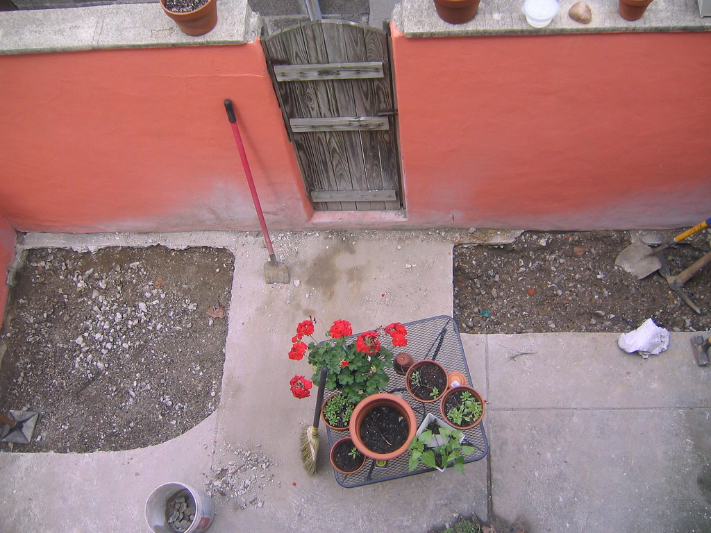
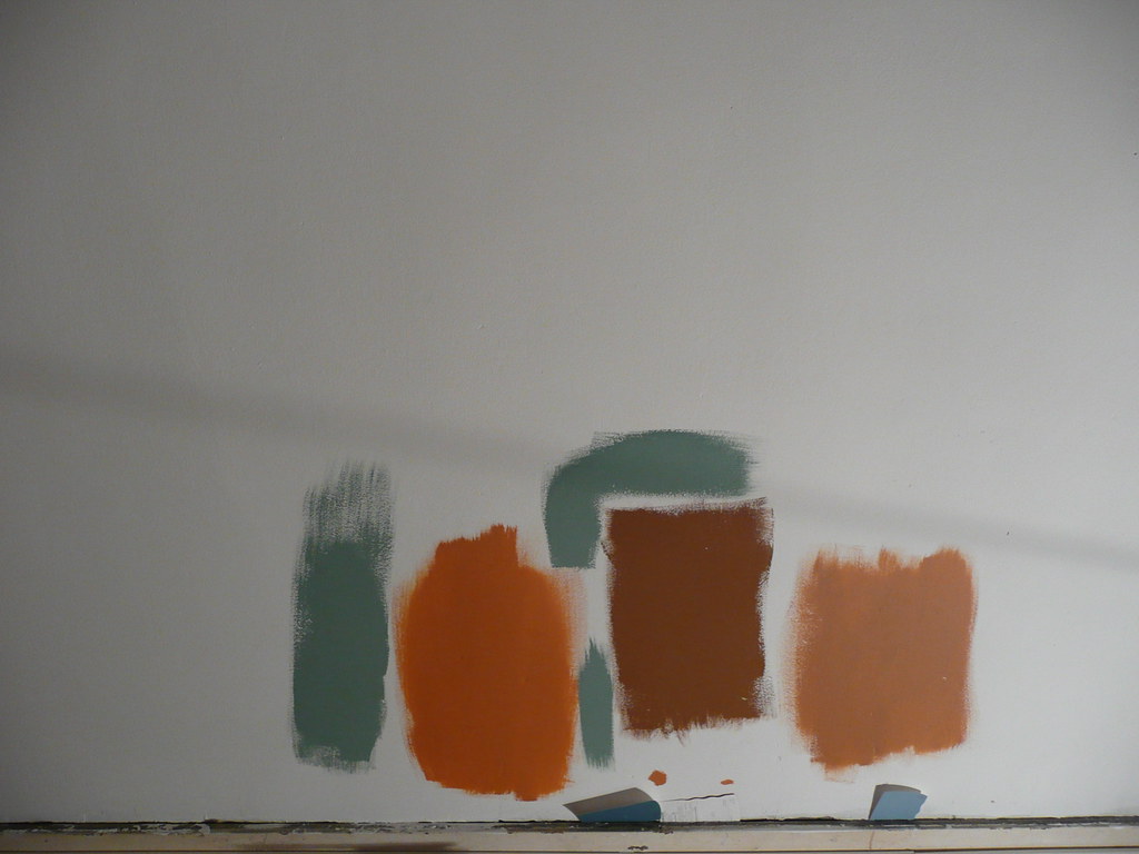
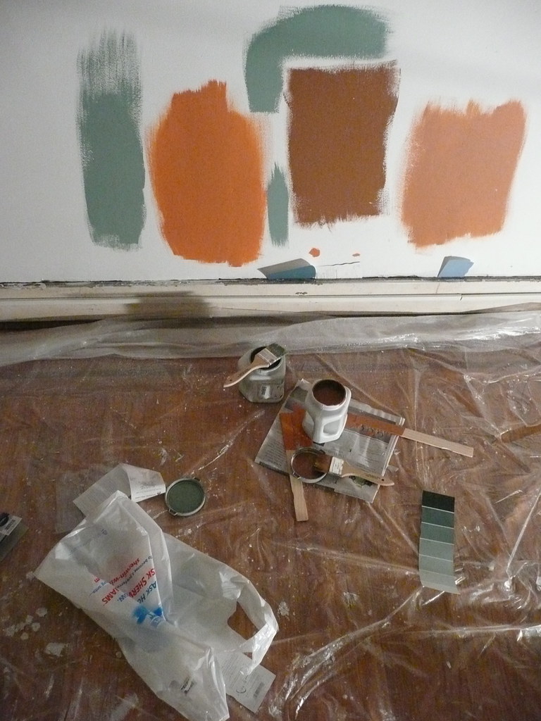
Bobby Brown on Mr. Hogarty and decided a warm orange, like a mix of mangoes and sun, was in our sleep future. And Mr. Hogarty indulged me - until we put our sleep future up on the wall and it didn't look right either [see 2nd and 4th colors from right in picture]. When it comes to orange, what is good for the back patio - orange! - is not good for the bedroom (as they say) and though the shades were called something like
Sienna's Miller and
Hut's Desire, they are actually more like orange-y brown and brown-y orange. We thought we learned our lesson there, but then we went back for Tanbark, which is (see brownest shade in picture) pretty damn dark/bark as well.
Why is warm in theory, dark on walls? Oh, paint/color theorist - read our blog, leave a comment and answer my inquiry.

Ed and I wanted no VOC paint and found an affordable line at Sherwin Williams about 8 blocks away. We used their website a lot, especially the handy "Color Visualizer' -- a tool that allows you to paint and re-paint (and re-paint and re-paint and take a break, watch a movie and paint and re-paint) the walls of a generic room choosing from any of the 700 colors with names like Shipshape and Ship's Mate and Procreate and Head of State, to name a few. But not only could we not find a generic bedroom on Color Visualizer that looked like ours, the virtual paint never looked the same when we got it home and put it up. Choosing a color ALONE is a hard task; choosing a color together is like trying to buy one pair of jeans that you can both wear -- ridiculous. One person has to persuade and the other person just has to go with it. Or, get sick of it and walk away. And come back an hour later and say, "Are you still using the Color Visualizer?" No, no, I'm really not.
But, the tall tale spins positively because, if we had just stuck with the icy boat, we would have never come up with Moroccan Brown and Underseas. See? [Pic soon]. We get our warmth and a little chilliness mixed together. Imagine a submarine off of Tunisia. Or a frigate at the Cape of Good Hope. That will be our bedroom. Warm. and cold. And Warm. and cold. And WARM...
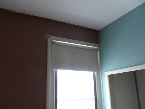
And for now we have our own Cy Twombly-like wall [see photo above]. Coincidental and odd because underneath the primer on this same wall, which was also once under 4 layers of wallpaper [see post titled "I fought the Wall and the Wall Won"], there is a heart drawn in pencil and inside the heart, some chicken scratch that says, (to the best of my knowledge): "When I grow up, I want to be a
undecipherable." And each word has a pencil line drawn through it. Very Cy.


Or maybe our attempts at Cy Twombley imitation should have gone on the other wall where - under 4 layers of wall paper again - we discovered a picture of a woman with no head; just a skirt covering a pretty big butt and some shapely legs. That one is a lot more Picasso...or no, that other guy...DeKooning.

Post post: No color theorist wrote in, so we did not know that Underseas would be too green to mix in well with the red, warm mud walls of Morocco. More research revealed that Home Despot also has no VOC paint called "Freshaire", and since the Deep is open on Sundays we were forced to buy paint that features in depth interviews of political leaders and topical and cultural icons and
TG fawning over anyone remotely related to The Wire. The color that we picked for the accent wall is called,
"Omar Coming". Not really, it's called: 'Healing Waters'.
The guy at the Deep told me that since their business is mostly contractors, I was only the second customer to buy no VOC paint in the whole two months that they've had it. The price is almost twice as much as what we paid at Sherwin Williams, so....go to Sherwin Williams. Or
Greenable in Old City, though I've heard that that one is pricey too.
But I can't think about the cost now. Let the Healing Waters flow...
